
Show notes
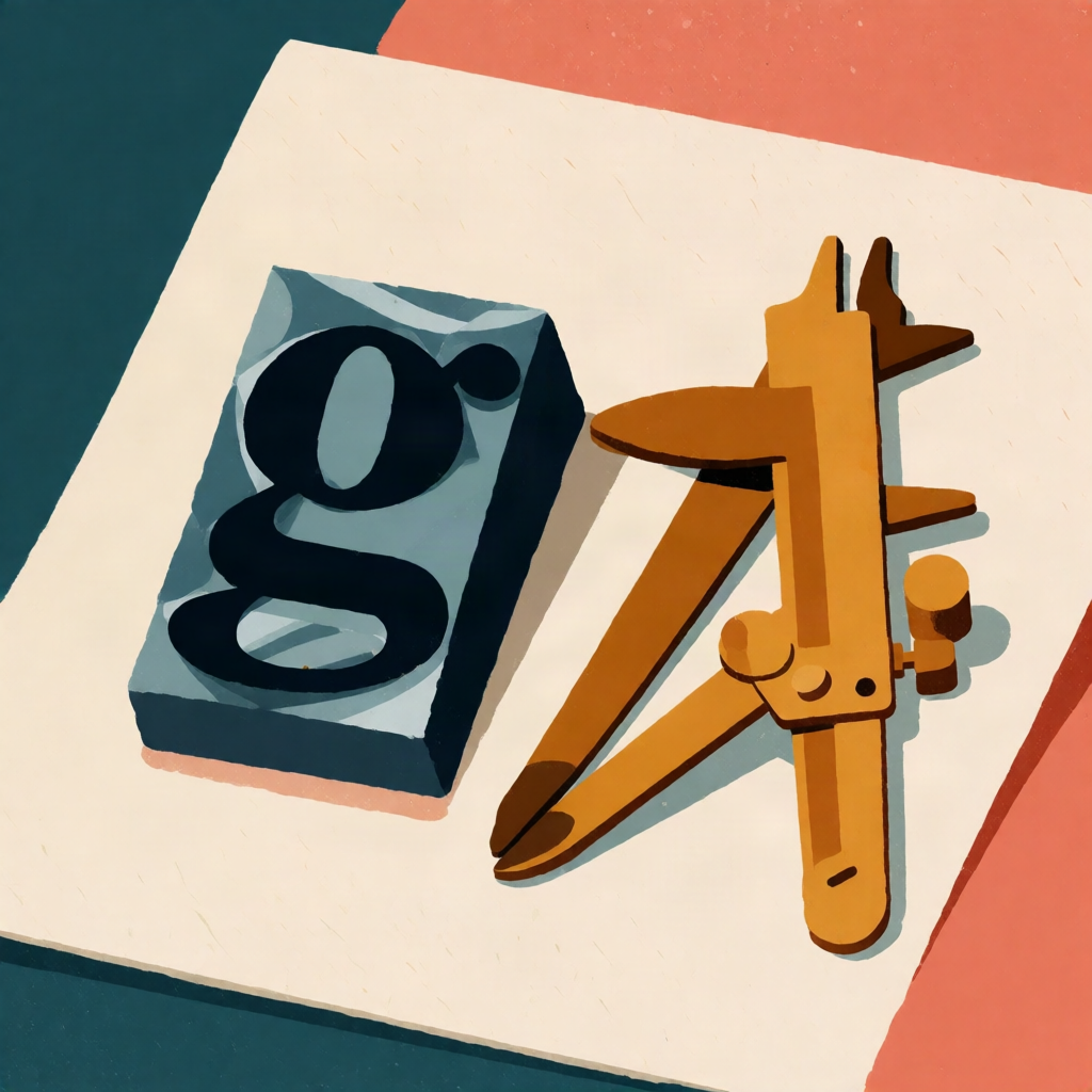
Every word read in public spaces or on screens was drawn by a type designer, yet legibility science and typographic craft remain at an impasse. A look into how typefaces are built reveals that century-old rules about serifs often fail basic methodological scrutiny. When Applied Design Works created Atkinson Hyperlegible for the Braille Institute, they abandoned classical harmony entirely, intentionally exaggerating letter shapes to help low-vision readers distinguish confusing characters.
Key sources:
• Braille Institute of America, Read Easier With Our Family of Hyperlegible® Fonts — https://www.brailleinstitute.org/freefont/
• Google Fonts, Atkinson Hyperlegible specimen/about — https://fonts.google.com/specimen/Atkinson+Hyperlegible/about
• Wikipedia, Typography — https://en.wikipedia.org/wiki/Typography
Episode 6528 — myweirdprompts.com/n/6528 (permanent short link: myweirdprompts.com/574357)
Listen on Android: MWP FM Player — myweirdprompts.com/apk
Website: myweirdprompts.com
